
 Facebook
 Twitter
 Pinterest
 Copy Link
Trend Alert: 8 Colors to Try This Season
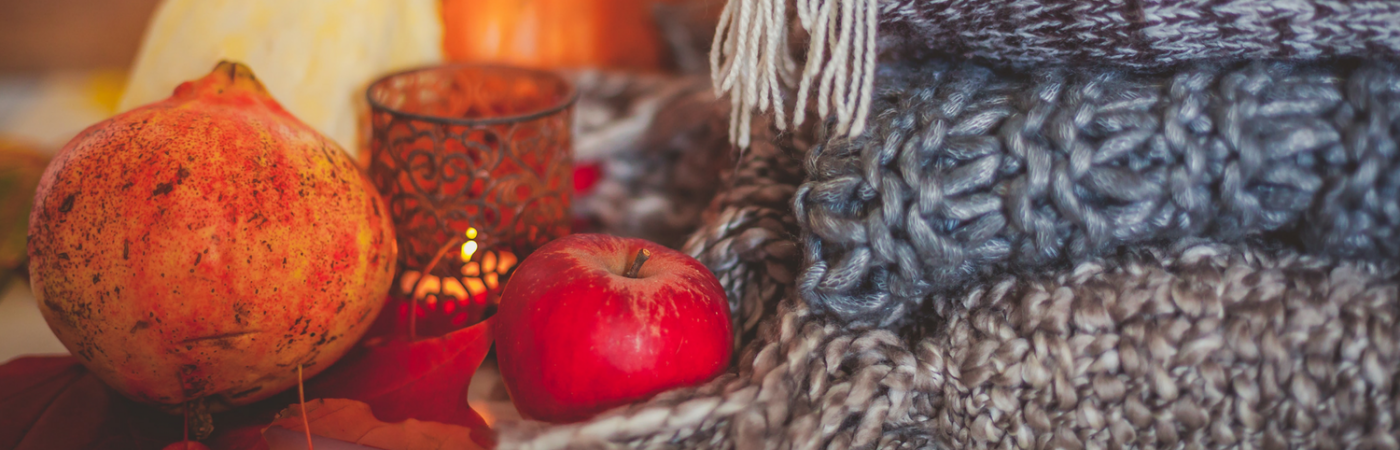
Now that October is here and it’s officially fall, breezy colors and summery decor will start to feel out of place. Make holiday houseguests and potential buyers feel at-home with the comfy, cozy and even cheerful shades of the season. Follow along as we uncover eight trendy colors that will last through the new year.
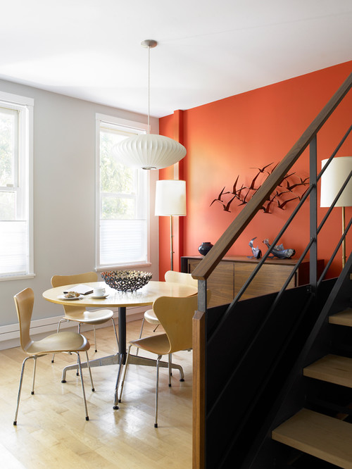
1. Pumpkin Spice
As everyone is lining up for their long-awaited pumpkin spice lattes, the hue also has a well-earned spot in home decor. It’s bold, exudes warmth and resembles the always festive holiday, Halloween. This color works well when painted on one wall, as shown above, or through accessories like rugs, pillows, and throws if you’re color shy. It pairs well with neutral colors and monochromatic palettes as it takes the spotlight in all of its seasonal glory.
2. Autumn Red
If you don’t use autumn red in autumn, when will you use it? Although it’s a dramatic shade, it can infuse any room with a fiery and fun vibe. It adds intense energy to contemporary and modern rooms while being a happy addition to any playful, eclectic space. Use it intentionally and sparingly in a room to enhance its overall effect.
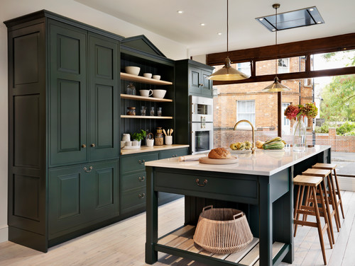
3. Emerald Green
There’s so much to love about this deep shade of green. Unlike the previous colors that are more playful, emerald draws from its roots in Mother Nature to create a sense of calm in any space. Serving as the focus in this kitchen, emerald green cabinetry marries perfectly with blond wood tones and light countertops. Wouldn’t you like to spend all holiday season here?
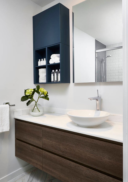
4. Navy Blue
Even darker and more daring than emerald green, navy is a close cousin to black. If you’re not psyched about displaying the iconic holiday colors in your home, but still want to stay on the dark side of the spectrum, this shade of blue is perfect for you. Honoring its origin from the British Royal Navy, this color embodies ultimate elegance, sophistication and power. Bringing navy into your home this season can have surprisingly health benefits too. It’s been shown to have a calming effect on the human body by slowing heart rate and metabolism.
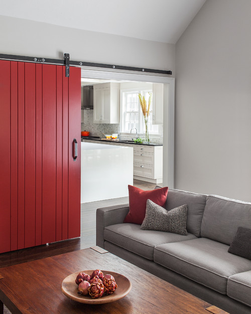
5. Wine
Often an overlooked shade of purple, wine would make a lovely addition to any home this fall. Following suit with the deep tones discussed above, it has the strongest effect when used sparsely, as seen in this Chicago bedroom. Purple has historically been a color of royalty and power. Its wine pigment is no different, conveying richness and seduction in every capacity.

6. Steel Gray
Gray is one of the most versatile hues on the spectrum and can easily be used all year-round. Having said that, it’s often hard to choose the right gray for the season. Light gray can be seen as a winter wonderland while charcoal can be hard to distinguish from black. Steel gray is a solid middle ground. It’s the star of the show in this contemporary London kitchen with its sharp, clean and defined lines.
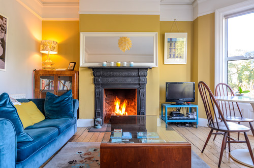
7. Mustard Yellow
A hue that echoes the falling leaves soon to come, mustard yellow provides warmth and joy to any space. It plays well with other bold colors, like the bright blue sofa and TV stand in this eclectic living room. For year-round summer lovers, this color can also serve as a happy reminder of the sunny days and will brighten up any interior.
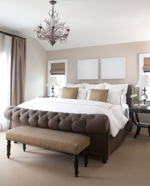
8. Brown to Beige
Brown is a classic fall color, but too much of it can make a home feel more like a cave. Instead, use brown as an accent color and brighten it up with a lovely beige tone. Add in some white decor for a gorgeous layered look, like you see in this Denver bedroom.
9 Kitchen Color Ideas That Aren’t White
Can’t quite figure out just exactly you are looking for when it comes to that color pop in the kitchen?
These fabulous ideas are worth a look!
Don’t get me wrong: White kitchens are cheerful, clean and classic — it’s no wonder why they’re so popular. But since white kitchens are everywhere, it’s easy to forget that there are other colors that can also look great in this space. Thinking about bucking the trend in your kitchen? Consider one of these options, from alternative neutrals to bright, bold hues.
NEUTRALS
You can’t go wrong with these versatile picks.
Charcoal Gray

If you want a cool neutral that’ll add a bit of drama to your kitchen, look to charcoal. Bright accent colors — or even white, as seen in this kitchen designed by Brian Patrick Flynn — really pop against it.
Greige

A mix between gray and beige, greige is an incredibly versatile neutral for the kitchen that can complement both warm and cool colors. In this space designed by Tobi Fairley, greige cabinets bridge the gap between warmer brass elements and cooler marble accents.
Black

A black kitchen may sound dreary, but it can actually be stunning if done right. Just take this gorgeous room that goes all in with black cabinets, a black vintage stove and a black-and-white tiled floor. If you’re not on board with an all-black kitchen, try adding one black element like a backsplash or a sink.
SUBDUED HUES
Add a touch of color without overpowering your space.
Pale Green

Hints of green in the stone countertops inspired the cabinet color in this country-style kitchen. The soft hue brings coziness to the space, yet still feels bright and fresh.
Butter Yellow
Particularly charming in a cottage- or farmhouse-style space, pale yellow adds a cheerful, sunny touch to a kitchen. Try it with robin’s egg blue or with neutrals, as seen in this kitchen designed by Sarah Richardson.
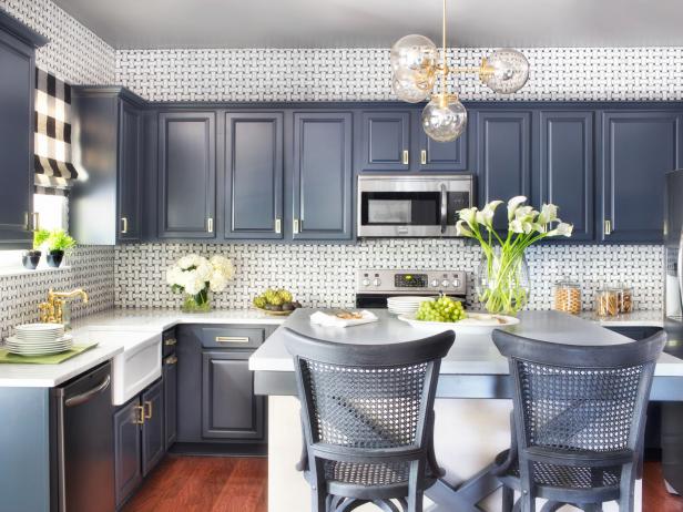
Navy Blue

Navy is practically a neutral — it pairs beautifully with everything from tangerine to turqouise to chartreuse. In the HGTV Smart Home 2014 kitchen, navy cabinets are offset by a black-and-white basketweave backsplash for lots of eye-catching contrast.
BOLD COLORS
Go all in with these daring shades.
Crimson

Want to instantly energize your kitchen? Just add a vibrant shade of red. To keep it from feeling overwhelming, try contrasting it with a cool color, like the blue-gray Brian Patrick Flynn used here. If you’re not ready to commit to red cabinets or walls, incorporate the color in small doses with red countertop appliances, dish towels and other accessories.
Emerald Green

Just a splash of this gorgeous green will make a big impact in your kitchen. In this design, Andrea Schumacher painted only the island, pulling a color from the floral wallpaper to keep the space cohesive. For an ultra-rich look, pair emerald with other jewel tones.
Orange

Orange is thought to stimulate the appetite, making it an ideal color choice for the kitchen. In this space by Jennifer Gilmer, an orange backsplash and zebrawood cabinets add warmth, keeping the contemporary design from feeling cold. Smaller orange accents, such as pendant lights or window treatments, can also liven up a kitchen.
Source: HGTV

")


